I showed the three handwritten texts to a small group and they said that the bolder text was the most effective, however they still didnt think it was appropriate for a campaign. They said that it lacked professionalism and they thought that using a typeface may work better.
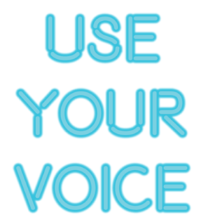
After asking what style of typeface would be appropriate for the campaign, and would appeal to the selected target audience, one person suggested using a neon lights style text. They pointed out that younger people are always looking for the next thing to post on twitter or instagram, and having something that is visually pleasing and eye catching would work best. I decided to take this on board and started experimenting with a neon light typeface. The typeface complimented the 'VOTE' written in the background of the poster, and after testing various colours, the text stood out and was a lot more impactful than the other types I had tested.
This was an experiment for me as I had never experimented with type to this extent, as I had to play around with numerous effects to make the text appear to glow, mimicking a neon light. The text is very effective and I have received much more positive feedback since changing the design.


No comments:
Post a Comment