Saturday, 8 December 2018

OUGD601 - INITIAL DESIGNS

INITIAL DESIGNS

To start the design process, I began with using small illustrations of rice grains and started to randomly place them on a brown background to give me an idea as to what it may look like once printed. I decided that I wanted to take inspiration from one of my images from my moodboard and use a white design on brown paper as I liked the simplicity and effectiveness of the packaging.


After experimenting with various sizes for the grain of rice, I decided to keep one consistent size and randomly place them to create a pattern. I then began to experiment with the type face I wanted to use. I knew that I wanted a bold sans-serif typeface that would be eye catching, but not overly complex. The typeface needed to go with the rice illustrations so I tested various typefaces next to this to see which worked best.

I tested:
Bureau Grot
Azo Sans
Nobel
Vinyl OT

   
I found that I preferred the look of Nobel the most, and when I showed a small focus group these different typefaces, the vote was unanimous and Nobel was voted the favourite.


I then tested the various weights of Nobel and again presented these to the same group to see which they thought was best. Bold Condensed was the favourite here so I began to test this typeface alongside the rest of my design. 

The next thing I tested was the layout of the packaging, I decided that I wanted to have a circular tube as my packaging, so needed to consider this when designing to see which layout would work best.


Considering this was going to be stuck onto a circular tube, I thought that having the type rotated down the side would look better, as it may have gotten distorted if it was landscape. Part of this design was to have portions for the rice so that people would avoid food wastage when portioning their rice. Originally, the box was going to include sections within the box with perforated holes down the side that was one portion. When the consumer needed one portion they simply poked the hole through and poured out the rice. So the next thing I designed on the box was the holes and whether to use perforated holes, or numbered holes. The perforated looked far more aesthetically pleasing and worked better with the rest of the design so I went for this option. 


Thursday, 6 December 2018

OUGD601 - PRACTICAL RESEARCH

PRACTICAL RESEARCH

Existing rice packets are generally quite dull unless they are microwavable packets which usually have a more interesting pattern on them. I found that the generic packaging for rice was a clear bag   with a  small label telling the consumer what it was.

The idea of having a package that has pre-made portions inside appealed to the group of people that I presented the idea to, all stating that they prefer to buy microwaveable rice or 'boil in a bag' rice as they have the portions measured out, meaning there was less food wastage.

In order for the product to stand out on a shelf amongst other rice packets, the product needs to be aesthetic and look different to the generic packets, whilst remaining functional.

Existing microwavable rice:


Existing regular basmati rice:


Thursday, 29 November 2018

OUGD601 - YORKIE BAR RESEARCH

YORKIE BAR RESEARCH

- famous in the uk for its former tag line "its not for girls". 
- the bar has always been targeted at men ever since its inception
-original idea was called 'rations' which would have tasted a lot like todays yorkie
- 'rations' was meant for men. it was 'to be eaten as a sustaining food, in the context of vigorous open-air activity'
- Rowntree's named the bar after its location Yorkshire
- in 2002 Nestle owned yorkie launched the aggressively macho campaign: "its not for girls"
- with tag lines such as 'not available in pink'
- the "its not for girls' line and the no women sign were removed from the packaging in 2012 and replaced with the slogan: "Man fuel for man stuff"

http://uk.businessinsider.com/the-story-behind-the-yorkie-chocolate-bar-2016-3/#however-rations-was-eventually-abandoned-due-to-its-association-with-wartime-austerity-6 

- Yorkie first launched "its not for girls" in 2002 in an effort to better target male consumers.
- Sampling activity around the campaign was banned in cities such as Birmingham and Liverpool after being deemed 'sexist'. 

Tuesday, 27 November 2018

OUGD601 - PRACTICAL DEVELOPMENT OF IDEAS

PRACTICAL DEVELOPMENT OF IDEAS

Having discussed with my group and with my tutor what I should do for my practical piece, I thought I had decided that I would do two different packaging designs, one that focuses more on the aesthetics and one that focuses on the practicality of the packaging. 
I have done some research into practical / sustainable packaging and lots of it isn't extremely aesthetic, so instead I have decided to design some packaging that is practical and has considered how the consumer would use the particular product, but also that looks aesthetic so that it would appeal to a consumer in a supermarket. 

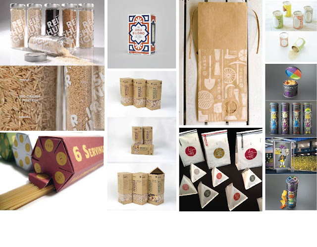
I have looked into what product I could focus my design on, and how I could make it practical for a consumer. I looked into resealable items which has been done before, but not always very well, but I also thought about how some food items are packaged with no portion guidelines such as pasta and rice. I saw one clever pasta packaging design for spaghetti that included a portion guide when pouring the pasta out of the package, this inspired me to think of how I could apply a similar tool to a different product. 

Rice is one food that is difficult to get right when it comes to portion control, also how to cook rice properly. I thought of creating a rice package that had portion guidelines within the design and also clear instructions how to cook rice as it is a daily food most households use. 

The initial idea for this would to perhaps design a tube or box that had portion sections which would organise the product into the correct portion amounts so that there is less food wastage at the end. I have made a moodboard with images that I have imagined my packaging to look like, along with existing alternative rice packages.

Saturday, 24 November 2018

OUGD601 - GROUP CRIT 22/11/18

GROUP CRIT

Within this crit, we presented our practical idea that will be produced alongside our extended essay. I was unsure as to what I wanted to produce for my practical as my initial idea was a little hazy and I was not feeling extremely enthused by the idea. I told my group what I intended on designing and then we discussed what would be the best option for me to do.


My initial idea was to design two different food packages using different techniques/styles for the same product to see which one people would choose, but after discussing this with my group, I realised that I wasn't actually achieving anything from this test as it all comes down to personal preference. I then told them my other suggestion of doing two different packaging designs, one that focuses on the aesthetics of the design and the other that focuses on the practicality of the design. My group much preferred this idea and said that this fitted better with my essay question.

Suggestions:
- Find an existing product that is ugly, but practical and compare it with aesthetic products
- The unboxing experience - how practical is that - add this into the essay
- Still use the idea of a window within the packaging to see the product inside as that is a practical and aesthetic element

Thursday, 22 November 2018

OUGD601 - ESSAY STRUCTURE / PLAN

ESSAY STRUCTURE / PLAN 

Intro:
- Introduce the question and topics to be covered. This essay will look into the influence food and drink packaging has on consumer purchase considering the various factors that affect it such as ... (topics), the aim is to gain a better understanding of ...

P1: Branding  
- What is a brand?
- Marketing strategy?
- Customer types
- Big brands and their power in supermarkets

P2: Theoretical Approaches:
- Introduce Ian Pavlov 
- Consumerism - Edward Bernays / Kant
- Validation of purchase

P3: Aesthetics Pt1
- Packaging designs + Competition in supermarket
- Gü - Innovative packaging

P3: Psychological Theories (1)
- Colour Theory

P4: Aesthetics pt2
- Masculine vs feminine design - relate to colours

P5: Psychological Theories (2)
- Nostalgia / emotional factors in purchasing

P6: Advertisement and their influence on consumer purchase
-Successful - Cadburys (relate to nostalgia factor)
- Unsuccessful - Pepsi - tarnished the brand?

P7: Trends
- Current trends and their influence, healthy vs unhealthy
- Sustainable
- Practical packaging vs aesthetic (relate to sustainability?)

Conclusion:
- What have I discovered?
- Heaviest influence / factor?

Thursday, 15 November 2018

OUGD601 - COP TUTORIAL 15/11/18

TUTORIAL 15/11/18

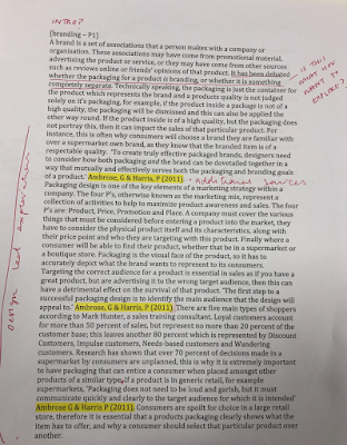
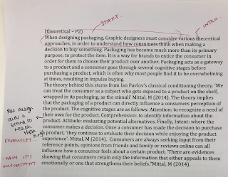
After submitting what I had began writing for my extended essay, I needed to get some feedback in order to know what to add/remove from the essay, and what I need to focus on in order to make sure that I am on track with it and that I am answering my question.

Feedback:
- Make sure to break down the large paragraphs into points you want to make and back it up with examples.
- Too much information on branding, either need to break it apart or add more design-relevant information into it so that it remains relevant to the question
- Keep referring back to the essay question and after every point that is made, make sure to question whether it is answering / debating the question and not going off on a tangent.
- Start to gather primary research so that you can back up your points. Ask packaging designers their opinion and their process:
What do they consider when designing something?
Do they research the brand when designing something new so that it ties in with their existing audience, or do they just focus on the product they are designing for?
Are they aware of the theories (classical conditioning etc) and is it something they consider when designing, or is it all design lead?
Can packaging change the audiences perception of the brand?
-BIGFISH is a studio to contact
- Look into other packaging studios / designers and contact them with a list of questions to help back up your points.
- Make sure that the essay is not split up into mini essays, make sure that it all flows together - don't just have a section on branding and then theory etc, mix it together and use all the research to back up.
- EXAMPLES EXAMPLES EXAMPLES

From my chat with my tutor it has helped me to look at the essay differently, I was intending to rearrange the essay regardless, however it was just a case of getting the information down first, then adjusting it to a more suitable format. I will remove some of the sections that are not very relevant to design and make sure to find examples where I can back up any points that I am making.